Hello World 2.0
Welcome to the New Look of the Website
Welcome to the new look of the website.
It’s a more straightforward system now: clear, legible, and intentionally organized—built to be easier for everyone to read and navigate.
The Old Design: A Website Shaped Like a SQL Editor
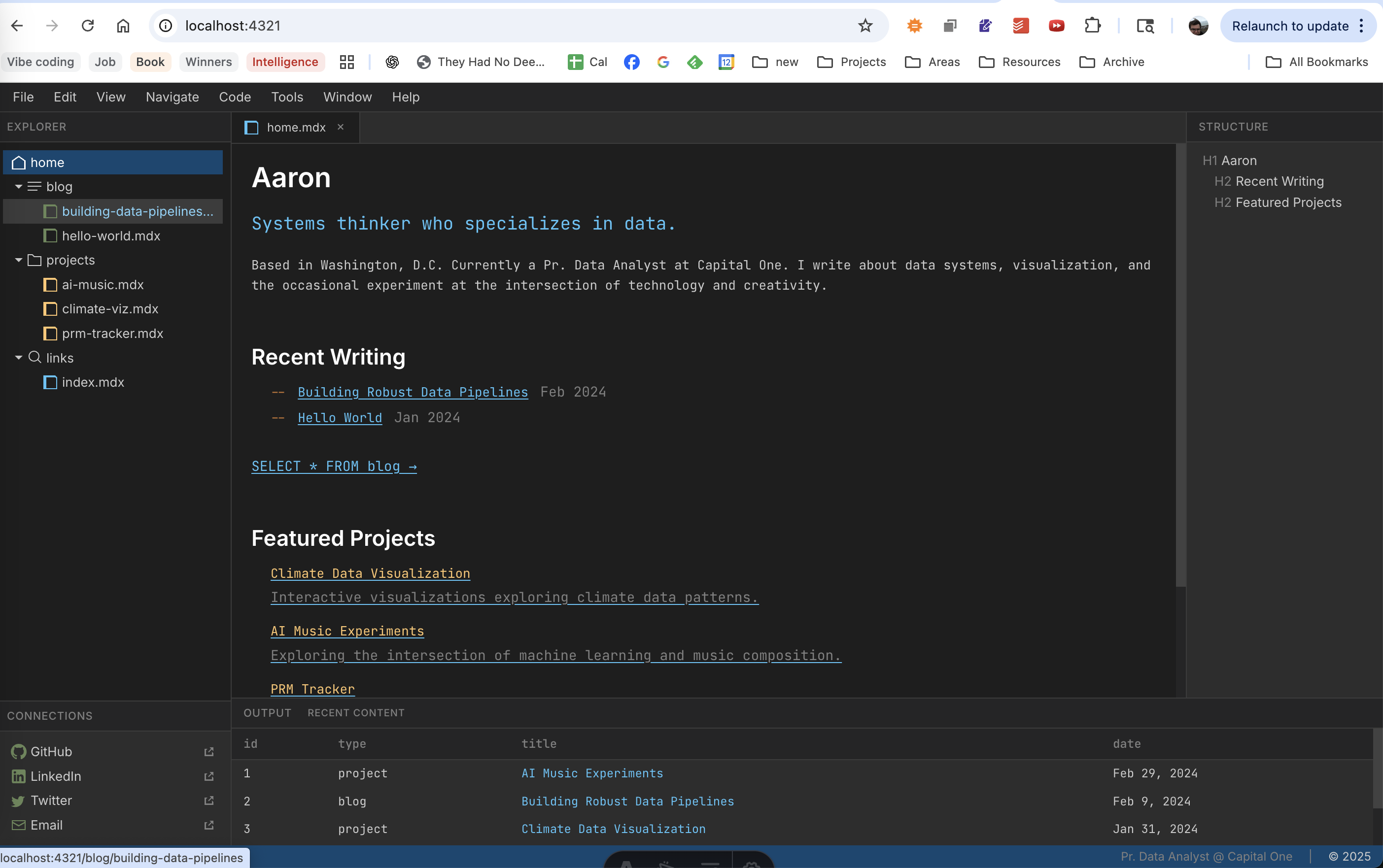
If you remember the original version of the site (the one I introduced in my earlier “hello world”), it was designed to look and behave like the DataGrip SQL editor. That wasn’t an arbitrary aesthetic choice—DataGrip is the tool I spend the most time in day-to-day, and it offers a genuinely compelling interaction model:
- A strong sense of structure and hierarchy
- A “workspace” feel that supports moving between sections quickly
- The ability to search through content in a way that feels native and powerful
In other words: the website wasn’t just styled like an editor; it was trying to borrow an editor’s navigation logic.
What Worked (and What Didn’t)
That design landed well with certain audiences:
- Programmers found it interesting
- People who were “computer-adjacent” described it as compelling, distinctive, and even memorable as a personal brand
But there was a major downside: it caused a lot of people to bounce.
Why Non-Technical Visitors Bounced
For visitors who aren’t technical, the UI cues communicated something very different than what I intended.
To most people, a screen full of panes and tool-like windows doesn’t read as “cool interactive portfolio.” It reads as:
- “Something broke.”
- “I’m seeing internal developer stuff.”
- “Did I accidentally open an inspector panel?”
In normal web browsing, multiple panes and dense UI elements are often associated with debugging tools: developer consoles, inspectors, logs—things that are not meant for everyday readers. So even though the design was intentional, it sometimes looked like an error state.
Back to the Drawing Board: Who Is This Website For?
So I went back to the drawing board with a simpler question:
Who do I want to be able to use this site most?
1) Me
I want a place where I can:
- view what I’ve written and worked on,
- keep it organized,
- and present it in a way that feels coherent and durable.
2) Everyone Else
I also want other people to be able to:
- read what I’ve written without friction,
- explore what I’ve built without needing context,
- and feel a bit of personality—not just a list of links.
The New Layout: Everything Front and Center
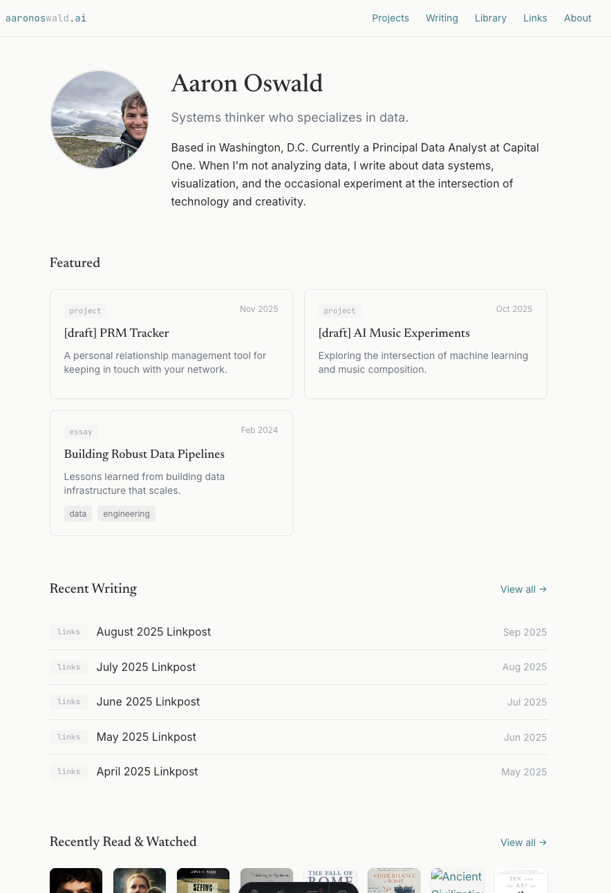
That’s what the new layout is designed to do.
The goal is to put the content front and center, with less fuss and fewer “UI puzzles.” It’s still my site, but it’s no longer asking visitors to decode a metaphor before they can read.
Adding Lifestyle + Character
To bring in more “lifestyle character” (and frankly, just more visual warmth), the site now highlights things like:
- project history
- film history
- book history
These elements add a pop of color and a sense of dimensionality—proof of taste and texture, not just output.
The Trade-Off: Sameness vs. Legibility
This is definitely a trade-off.
There’s a real tension here that people like Lindy Man (and others writing in that orbit) point to: economic and market pressures tend to push products—especially interfaces—toward a certain sameness. Toward familiar layouts. Toward patterns people already recognize. They call this Refinement Culture
And sometimes that’s frustrating.
But sometimes it’s also fine.
Because “recognizable” doesn’t have to mean “soulless.” The challenge is figuring out how to keep the site usable while still finding ways to break through the default template and make it feel unmistakably personal.