Footprint
A simple tool to visualize and understand America's bank branch networks since 1994
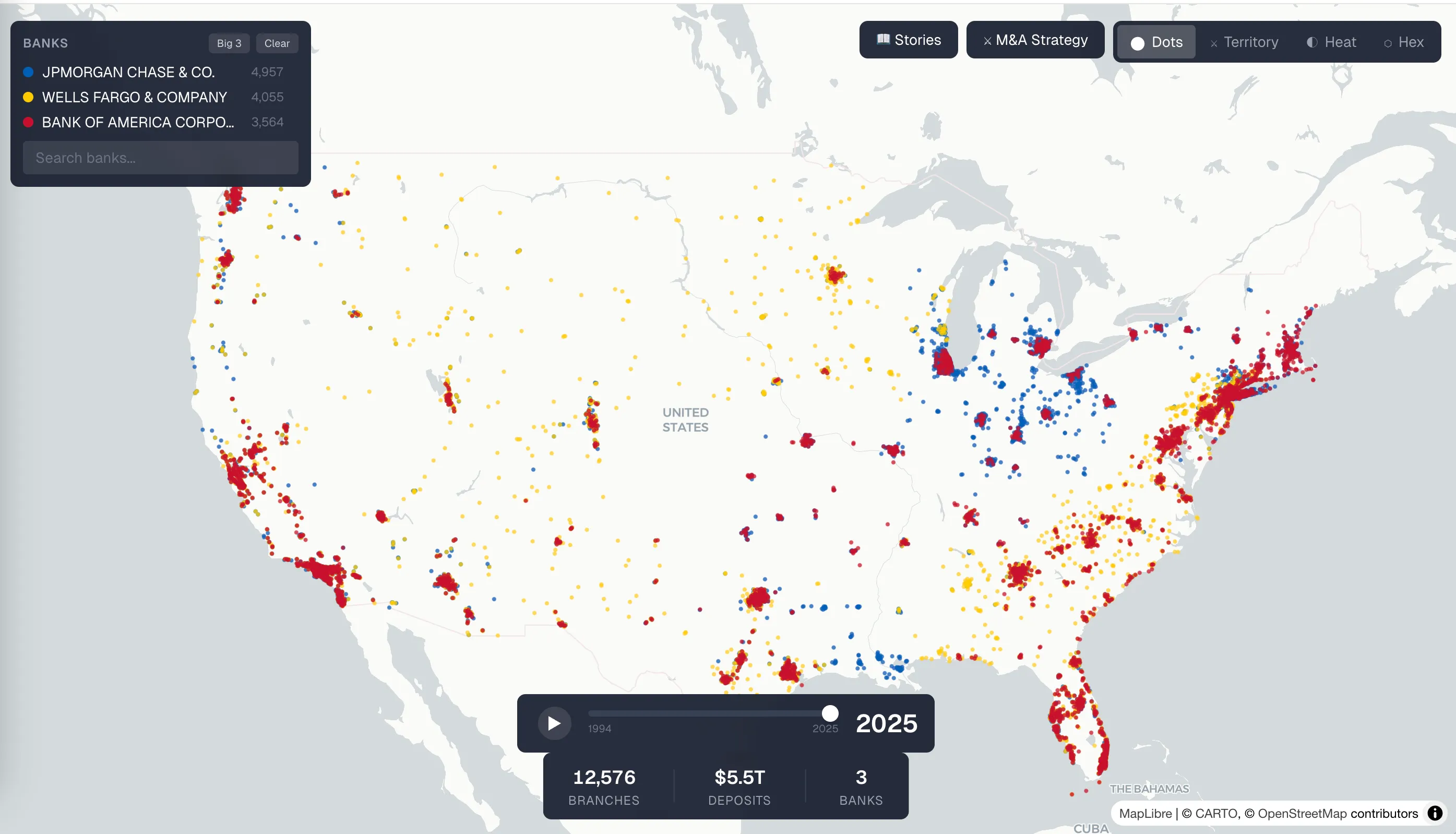
Footprint is a visualization of America’s branch bank footprints from 1994 to the present.
At its core, it is a way to watch how banks expanded across the country over time. You can see the transition from a more fragmented, regional banking system into the world we have now, where a handful of giant banks dominate huge parts of the map.
What first got me interested in this was actually Wikipedia.
In my day job working at a bank circa 2021, I spent a lot of time researching competitors. That often meant doing something very simple: reading their Wikipedia pages. On many of those pages, there would be these beautifully made maps showing a bank’s branch network at a particular moment in time. I kept thinking: these are great. They tell a lot of the story instantly.
But I also wanted more than a static map. I wanted something dynamic, something more exhaustive, something that could actually be explored.
Eventually I learned that the person making many of those Wikipedia maps had built a tool that pulled branch data from the FDIC, plotted it, and then turned it into something usable for Wikipedia. It was one of those classic internet moments where a very dedicated Wikipedian (Magog the Ogre) had quietly built an incredibly useful piece of infrastructure just to make the world a little better.
As someone who worked at a bank, I was immediately interested in whether pieces of that idea could be used in-house. Back in 2021, during COVID, I thought about it seriously. But like a lot of side ideas, it never got the time or attention it needed. Other priorities took over.
More recently, though, I wanted to see what Claude could do with the concept.
So I gave the little robot guy the FDIC source and the basic vision, and together we were able to build Footprint.
What I wanted it to do
There were a few things I specifically wanted out of the project.
The first was straightforward comparison.
When a bank merger is announced, one of the most interesting questions is: what is actually happening here? Is this an expansion play, where the acquirer is trying to enter new geographies and metros? Or is it a synergy play, where the two banks already overlap heavily and the real goal is consolidation and branch closures?
A footprint map helps answer that immediately. You can see whether two banks complement each other or cannibalize each other.
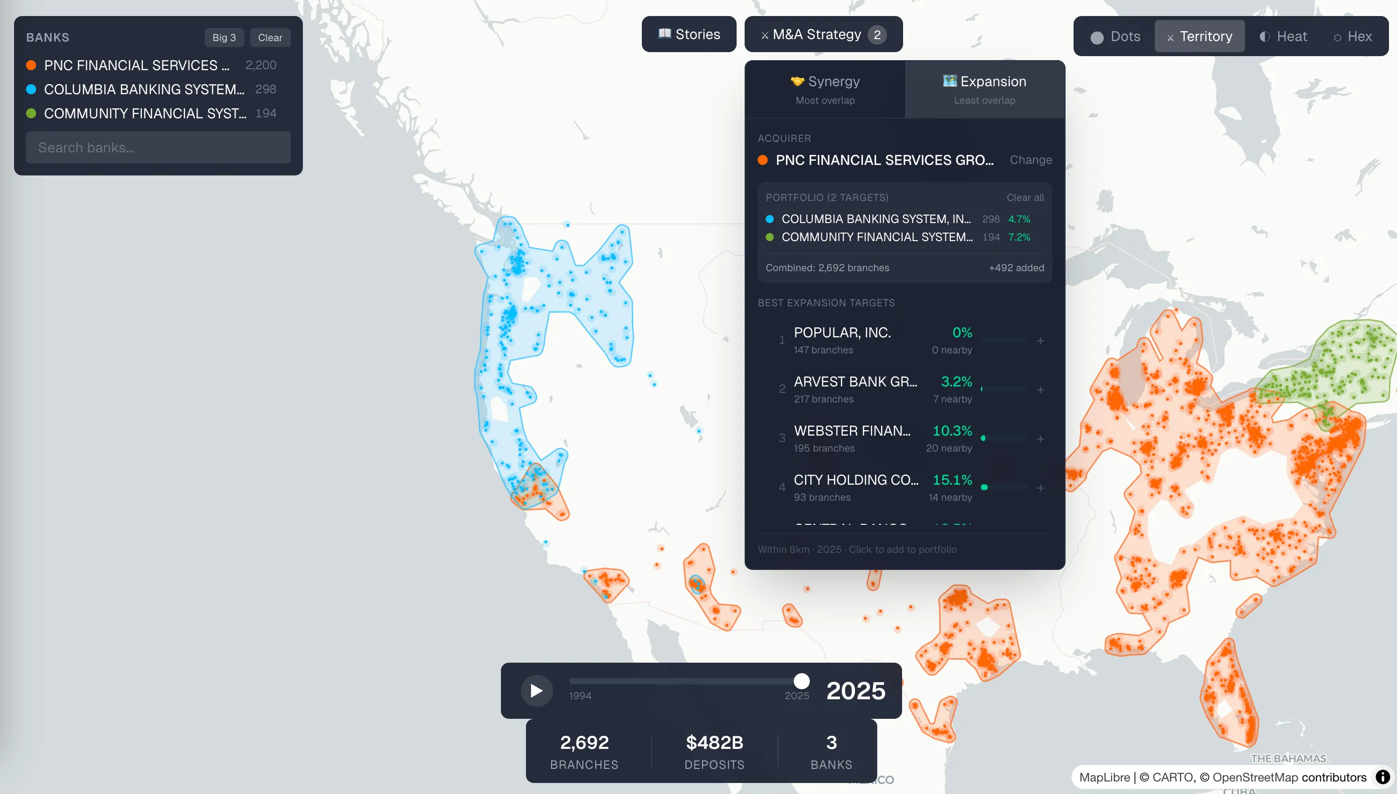
The second idea was more ambitious: I wanted to understand the incremental path to building another truly national bank.
If you wanted to turn America’s big three banking system into a big four or big five, what sequence of acquisitions would actually get you there? What constellation of banks would need to come together?
We ended up building a kind of M&A simulator for this. You can select a bank, identify the farthest useful acquisition target, and incrementally build outward — essentially a “build your own big bank” tool. There are some funny edge cases in the data, including the fact that if you just go by certain priority rules, there is a Puerto Rico-only bank that every other bank would have to acquire first. I do not think that reflects how the economics would work in real life, but it is exactly the kind of thing that makes the exercise interesting.
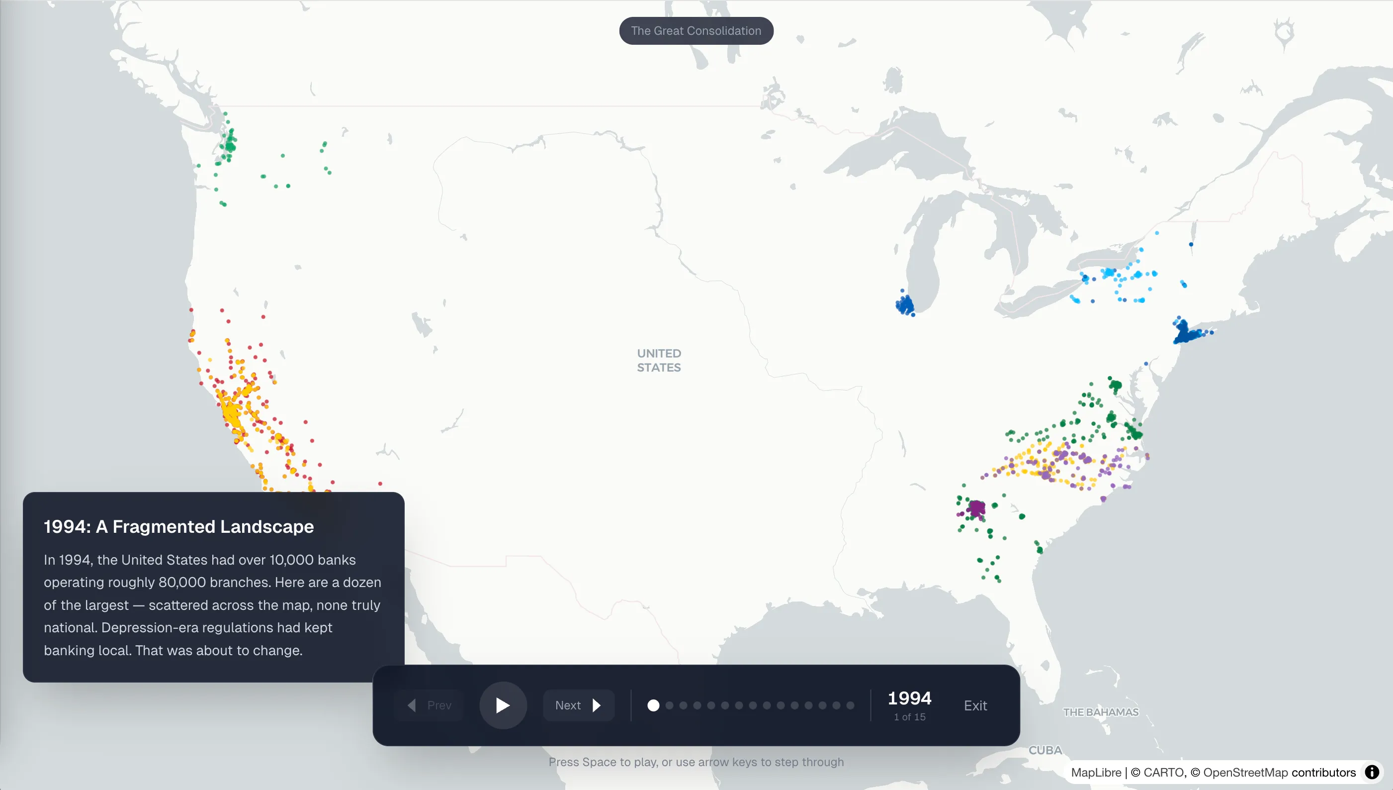
The storytelling layer
The other major component is the stories feature.
This comes from the idea of scrollytelling — the New York Times-style format where the reader scrolls and the visual changes along with the narrative. I have wanted to build something like that for a while, and Footprint felt like a good first proof point.
We currently have two stories.
One is the broad industry story: how America moved from a post-interstate-banking world, to a more regionally organized system, and then into today’s big-three era.
The other is a story about Chase. I did not come up with that one — Claude did. The guy more or less decided, “This is the story I want to tell,” and it ended up being genuinely interesting. One of the things I learned through that process is that Jamie Dimon’s roots do not really come from the old Manhattan Chase story people might assume. He come from Bank One! But he’s the Chase guy!
What I want to add next
There are a lot of directions I would still like to take Footprint.
One is making the competitive picture more local. A national footprint is useful, but banking competition often happens market by market, county by county, neighborhood by neighborhood. I would like to better show how competitive different local footprints actually are.
Another is layering in demographic and socioeconomic interpretation. Which banks skew more rural versus urban? Which seem oriented toward higher-income or lower-income markets? Which have a distinct cultural or regional identity?
In other words: can you use branch geography to say something meaningful about who a bank is for?
Maybe even to answer questions like: is Redneck Bank actually for rednecks?
And that is really what Footprint is about.
It is a way to make the geography of American banking legible — and a way to explore the stories hidden inside it.
What this project taught me about AI
One of the most interesting parts of building Footprint was seeing where Claude was excellent and where it still struggled.
The robot was remarkably good at turning a verbal product vision into something functional. In many ways, it built exactly what I described. That part felt almost magical.
But it also exposed one of the current weak points of AI-assisted creation: verification.
For example, in storytelling mode, it might say something like: one bank is shown in red and another is shown in blue. Then you look at the page, and both are red. The underlying concept is right, but the visual execution is wrong. And because the issue is visual and specific, verifying it becomes weirdly expensive. You have to manually check his work.
That feels like one of the clearest lessons from the project. Generation is getting cheap. Verification is still expensive.
Claude can build. He can describe. He can infer. But making sure that every visual detail is actually correct — especially, especially when narrative, visualization, and interface have to line up perfectly — still requires a human in the loop.